How To Authenticate Casablanca Clothing
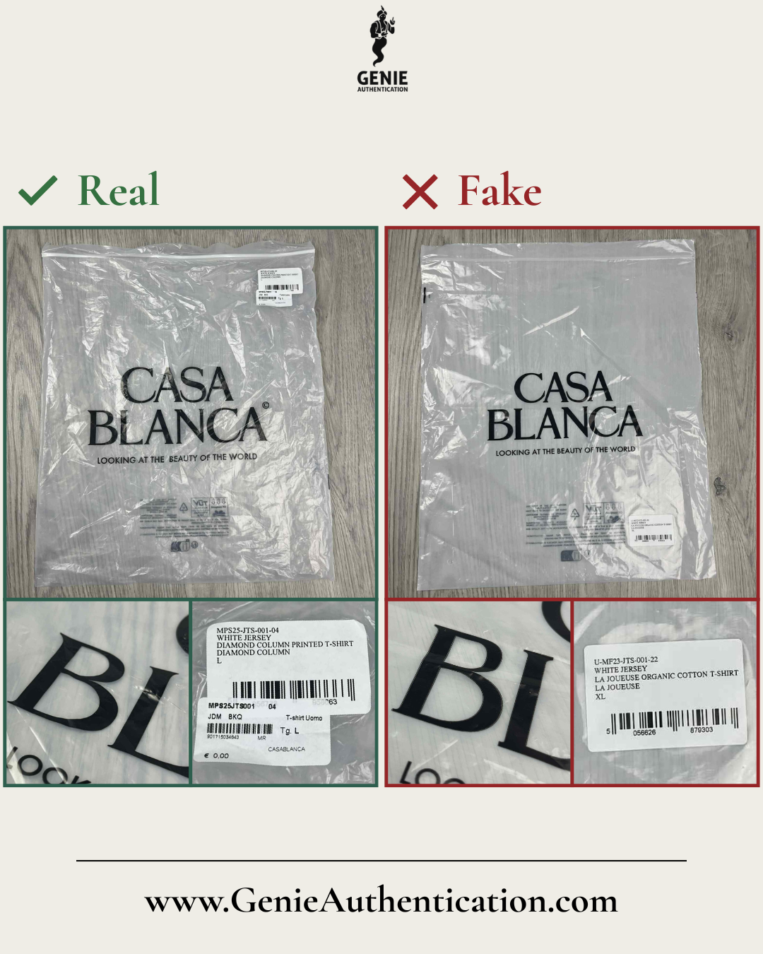
Bag
In this example, the counterfeit bag appears opaque, in contrast to the clear transparency of the authentic version.
It also features incorrectly printed text, with a faint outline visible around the edges of the letters.
The counterfeit also prints the sticker incorrectly, showing improper spacing, with larger gaps between each line of text.
Additionally, the barcode number on the right side is misaligned too far to the left, and the numbers themselves are rendered in an incorrect font and shape.
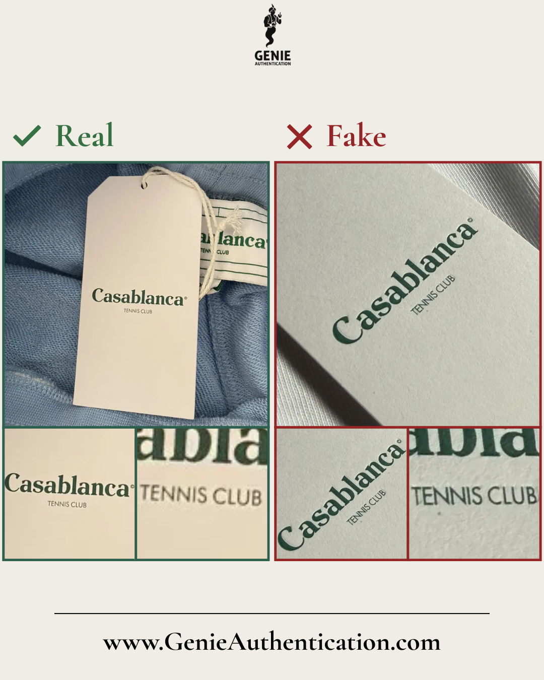
Swing Tag (Front)
In this example, the spacing between the letters in 'TENNIS CLUB' is noticeably tighter, with minimal separation between characters and a slight difference noticeable in the shape of letters 'C' and 'B'.
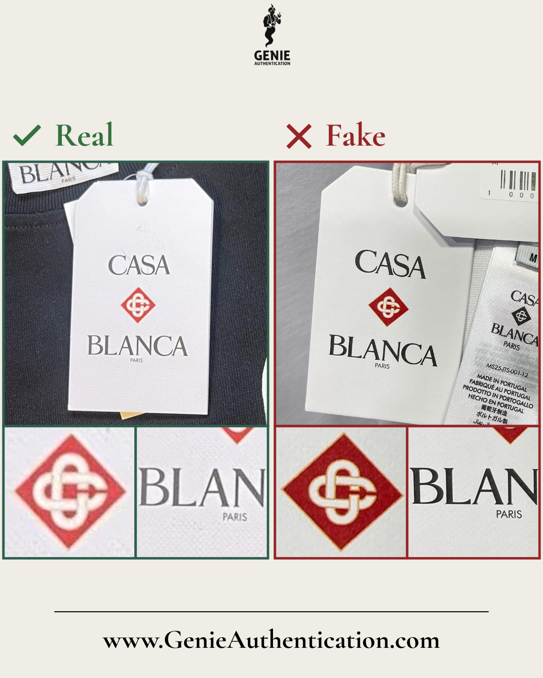
Swing Tag (Front)
In this example, the counterfeit mis-sizes the logo, resulting in an inner logo that is noticeably too small in proportion to the larger diamond backdrop.
Additionally, the inner logo appears distorted, with misaligned proportions.
Furthermore, text on the counterfeit appears slightly thicker.
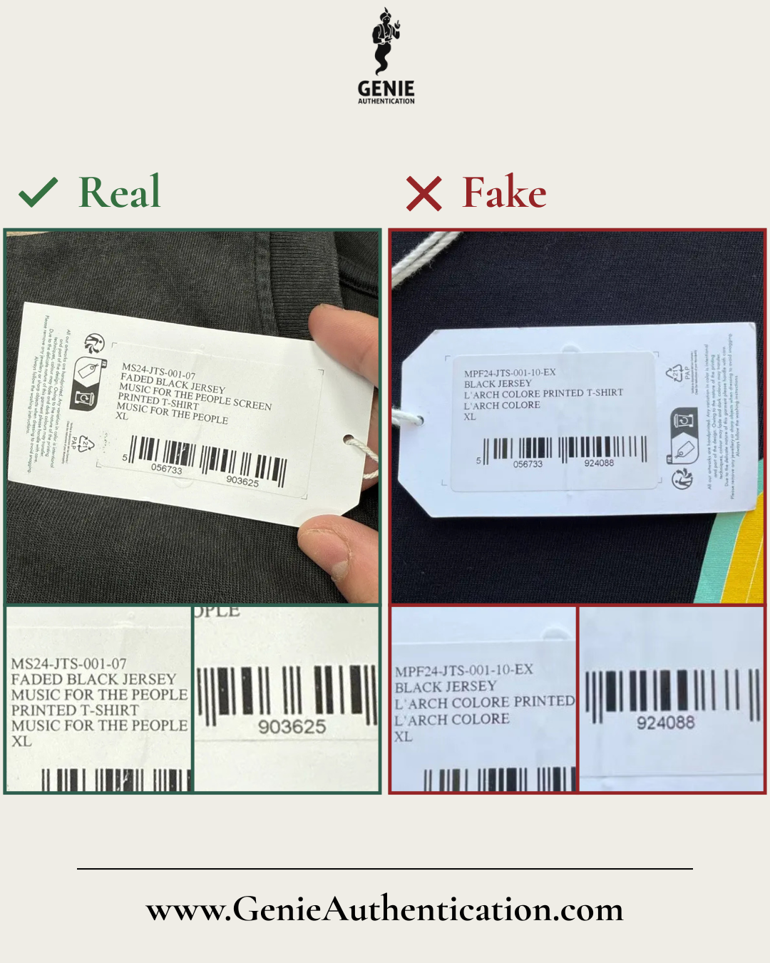
Swing Tag (Back)
In this example, the counterfeit text shows improper spacing, with larger gaps between each line of text.
Additionally, the barcode number on the right side is misaligned too far to the left, and the numbers themselves are rendered in an incorrect shape.
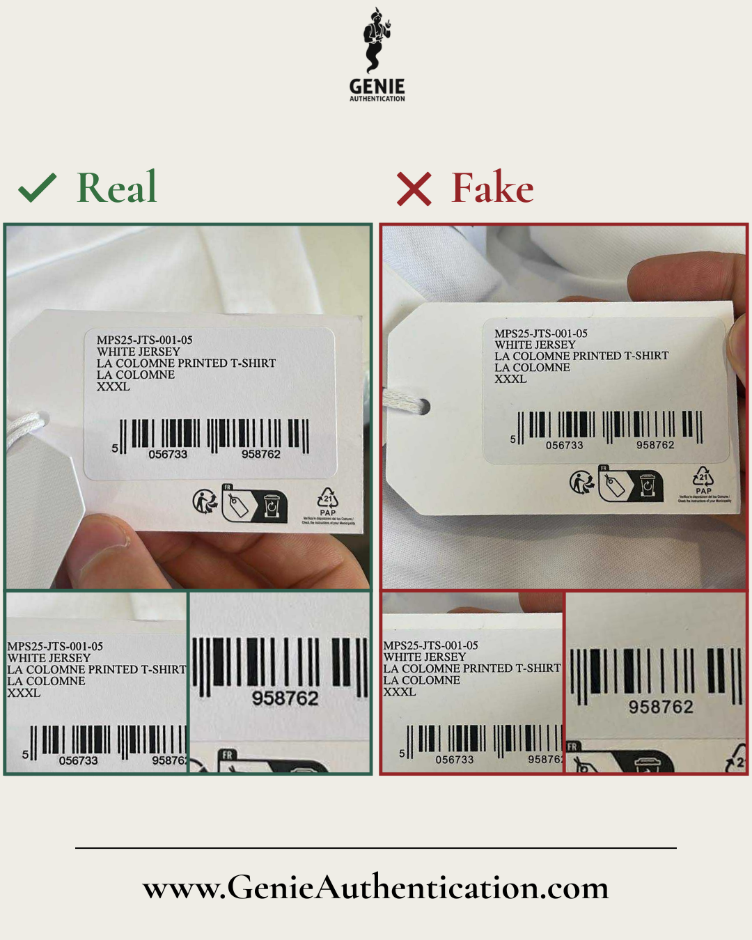
Swing Tag (Back)
In this example, the counterfeit's text appears to lack the boldness present on the authentic's text.
The counterfeit's barcode numbers appear thinner with larger spacing present between each number.
Additionally, the barcode number's appear to be positioned further down from the barcode than visible on the authentic version.
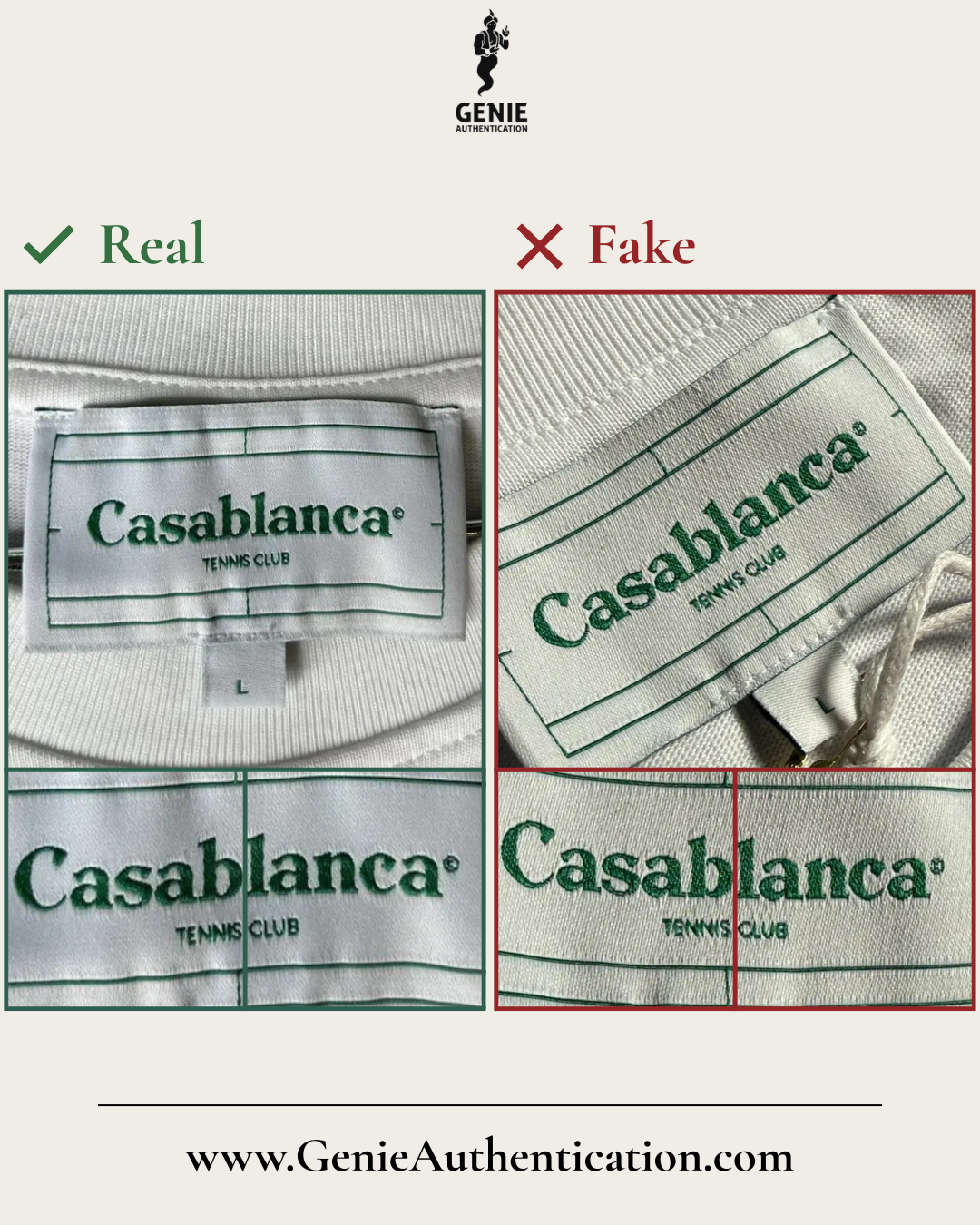
Neck Label
In this example, the counterfeit label exhibits several font inconsistencies, including the letter ‘b’ appearing disconnected in the middle and missing the sharp thin line to top, the letter ‘c’ misshaping its characteristic extended overhang, and the lower part of the letter 'n' missing its gradual curve into baseline.
The ‘TENNIS CLUB’ text shows errors such as malformed letters, most noticeably letters 'E', ‘S’, and 'B', and the text appears unclear with some letters conjoined such as 'C' and 'L'.
Additionally, the stitching on the size label extends well beyond the label’s edges on both sides, which is inconsistent with authentic craftsmanship.
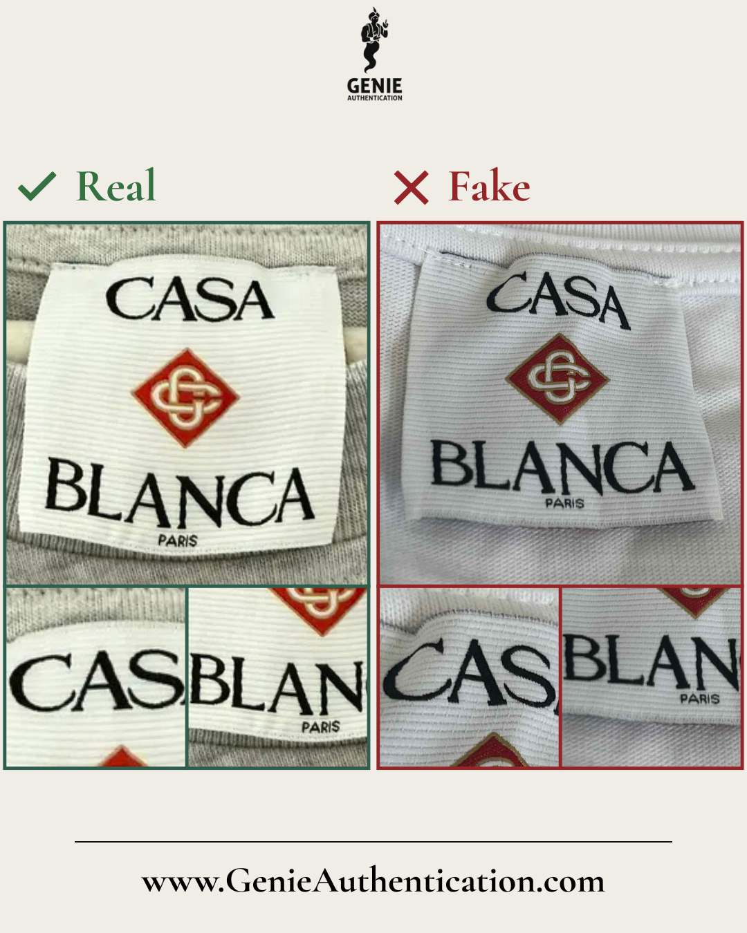
Neck Label
In this example, the ‘CASA BLANCA’ text shows multiple font inconsistencies, most notably letters 'C', 'S', 'B', 'L', and 'N' with their serif structures differing from the authentic design.
The ‘PARIS’ text is rendered in an incorrect font, most notably with the letter ‘A’ appearing significantly wider than it should. The text also appears smaller and positioned incorrectly on the label, showcasing minimal spacing between the 'BLANCA' text above, and conversely large spacing to the bottom of the label beneath.
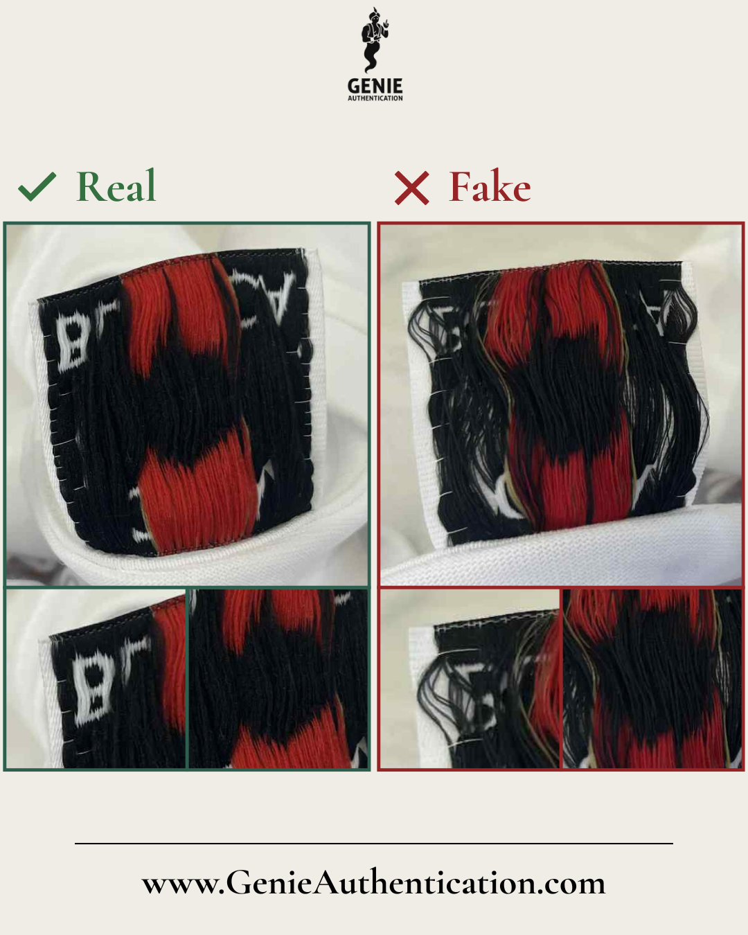
Neck Label (Back)
In this example, the backside of the counterfeit's neck label is poorly made, with threads loose versus the authentic's neat and tidy label.
The authentic label shows white binding threads that form a consistent, structured pattern, whereas the counterfeit possesses minimal white binding threads that are not produced in the same structure, instead appear loosely arranged.
Additionally, the authentic features fine white thread details extending from the letters, which is a subtle element that is missing on the counterfeit.
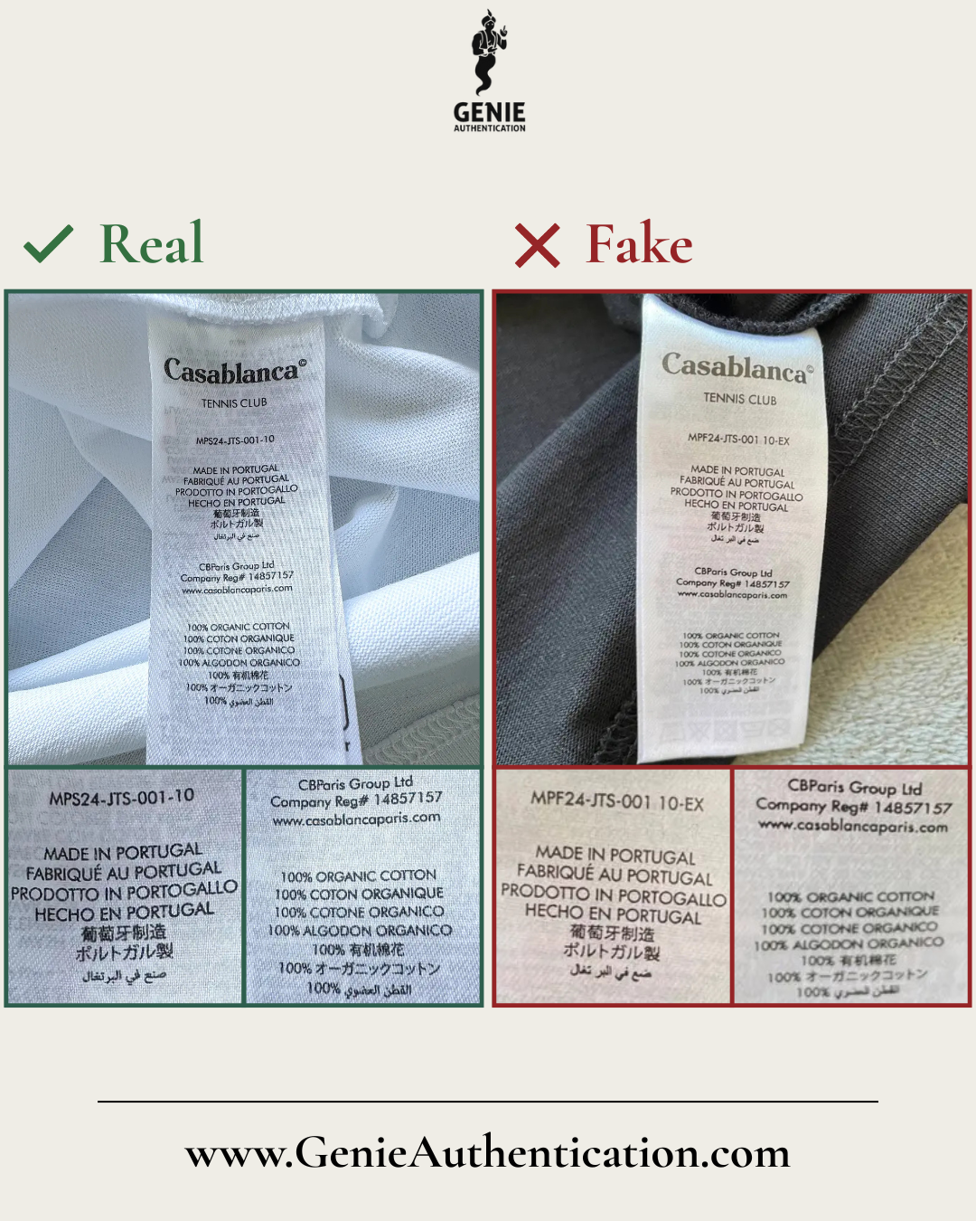
Wash Label
In this example, the counterfeit label displays a noticeably smoother print finish compared to the textured finish found on genuine wash labels.
The font used is incorrect, with noticeable letterform differences visible such as letters ‘P', 'A’, ‘L’, 'B', 'E', 'Q' and the number '4'.
The arabic 'Made In Portugal' text to bottom is also noticeably different, with misshaped letters, spacing issues and incorrect letter joins.
Additionally, the counterfeit misplaces the dashes in the model number, positioning them too high and omitting the dash between ‘001’ and ‘10’.
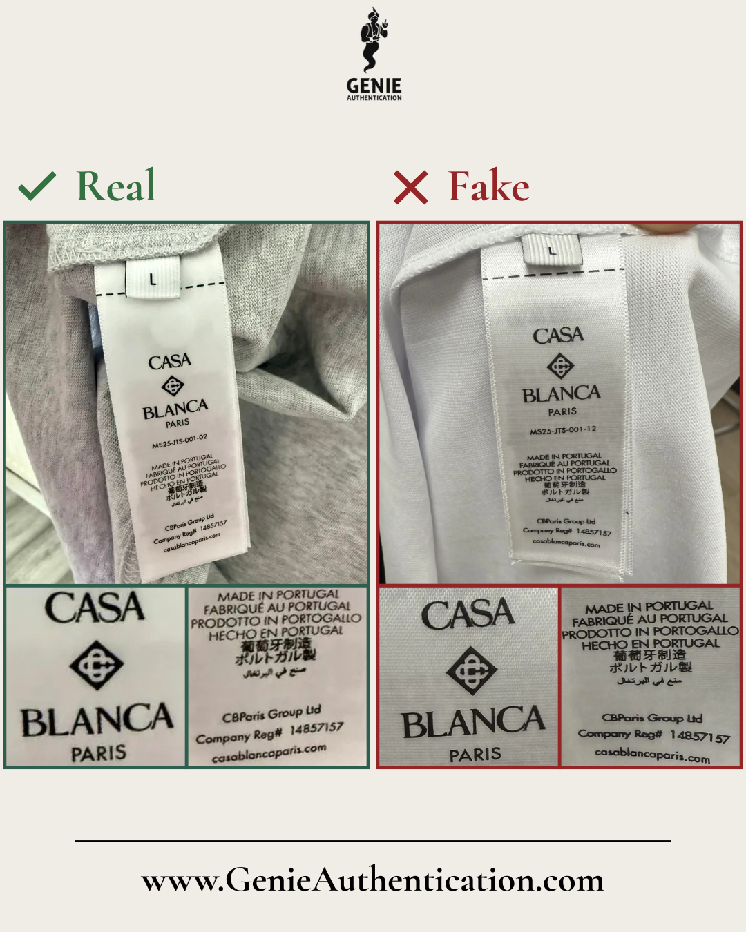
Wash Label
In this example, the counterfeit label misprints the ‘CASA BLANCA’ text, with several letters appearing conjoined.
The diamond logo is also poorly replicated, lacking the accuracy nor symmetrical curvature seen in the authentic version.
The font used is incorrect, most notably in the letters ‘A’ and ‘L’, and the text appears too thick with many letters appearing conjoined to one another.
The arabic text showcases letter shaping errors and spacing issues, and the dashes in the model number appear too highly positioned.
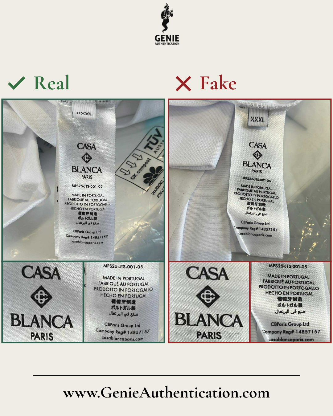
Wash Label
In this example, the counterfeit uses an incorrect font and prints the text far too thick.
The counterfeit label also misprints various elements of text incorrectly, most noticeable in the 'PARIS' letters, such as 'P', 'R', and 'S', or when comparing the the website text at the bottom of the wash label.
Additionally, the arabic text showcases letter shaping errors and spacing issues.
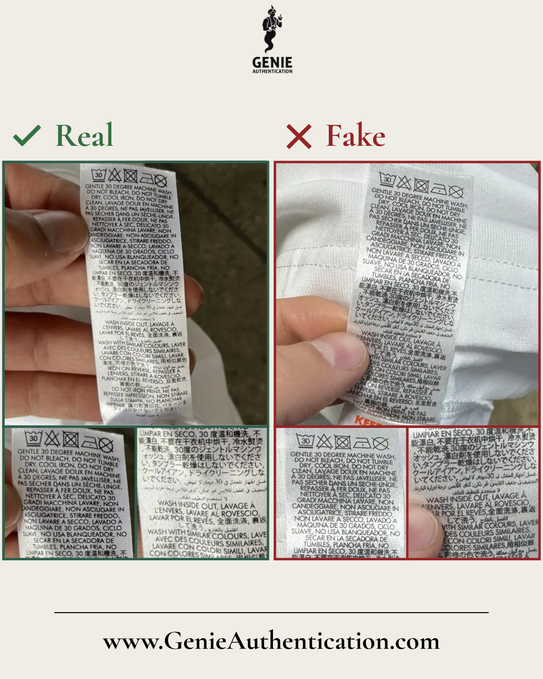
Wash Label (Continued)
In this example, the counterfeit label misprints the number ‘30’ in several areas across the tag.
Additionally, the text appears thick with multiple letters appearing conjoined and lacking the appropriate spacing as visible on the authentic label, which compromises legibility.
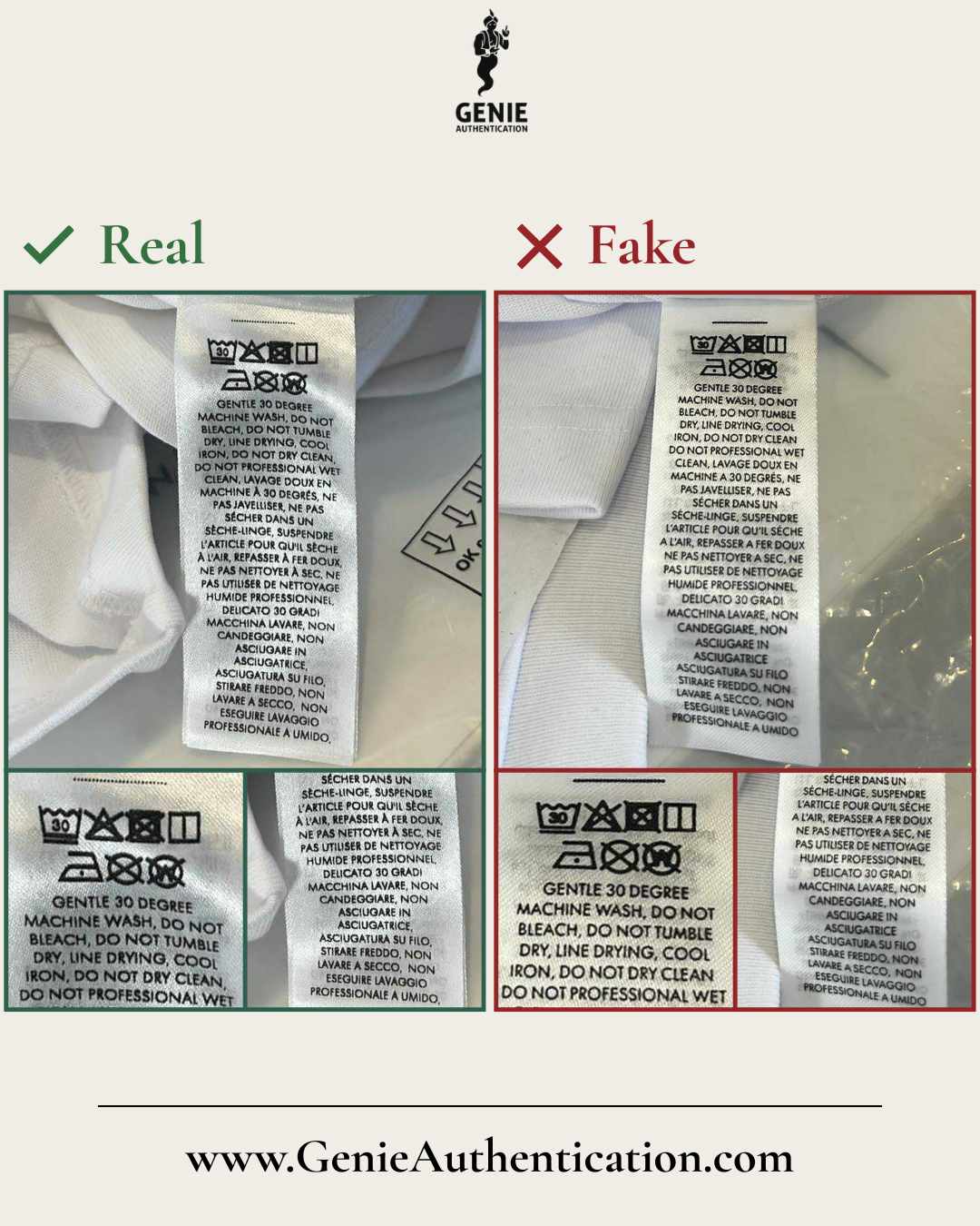
Wash Label (Continued)
In this example, the counterfeit label misprints the wash labels, most notable in the '30' and 'W' text inside the final wash symbol.
The dots positioned at the top of the label are printed so heavily that they resemble a thick line rather than the fine, delicate dots.
The counterfeit omits the accent above the letter 'A' throughout the label.
Additionally, the counterfeit's text lacks the same spacing visible in an authentic label, with letters appearing too close to one another and some conjoining.
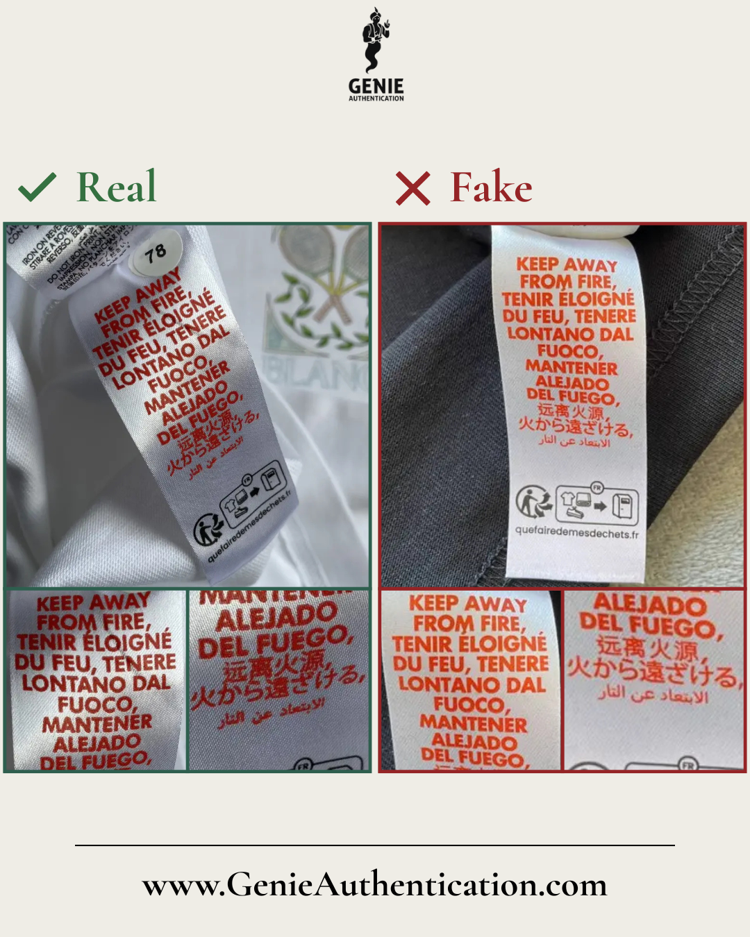
Wash Label (Continued)
In this example, the counterfeit label features overly thick text, causing the letters to appear cramped and poorly spaced.
Additionally, the overall text size is noticeably smaller and lacks the correct proportions when compared to the authentic label.
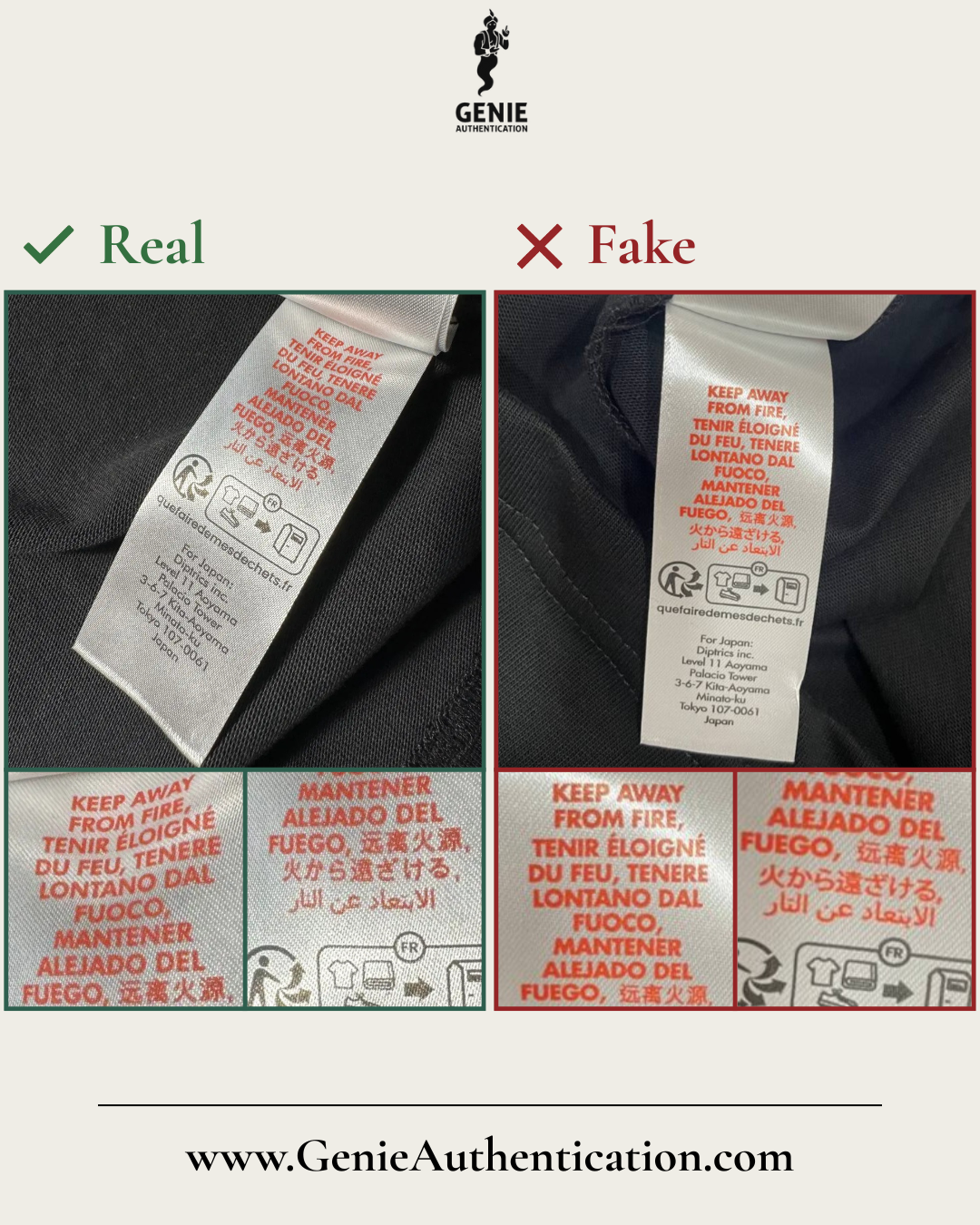
Wash Label (Continued)
In this example, the counterfeit label features overly thick text with letters positioned too closely together, disrupting the intended spacing.
Additionally, the text is printed much lower on the label, leaving an unusually large blank space at the top.
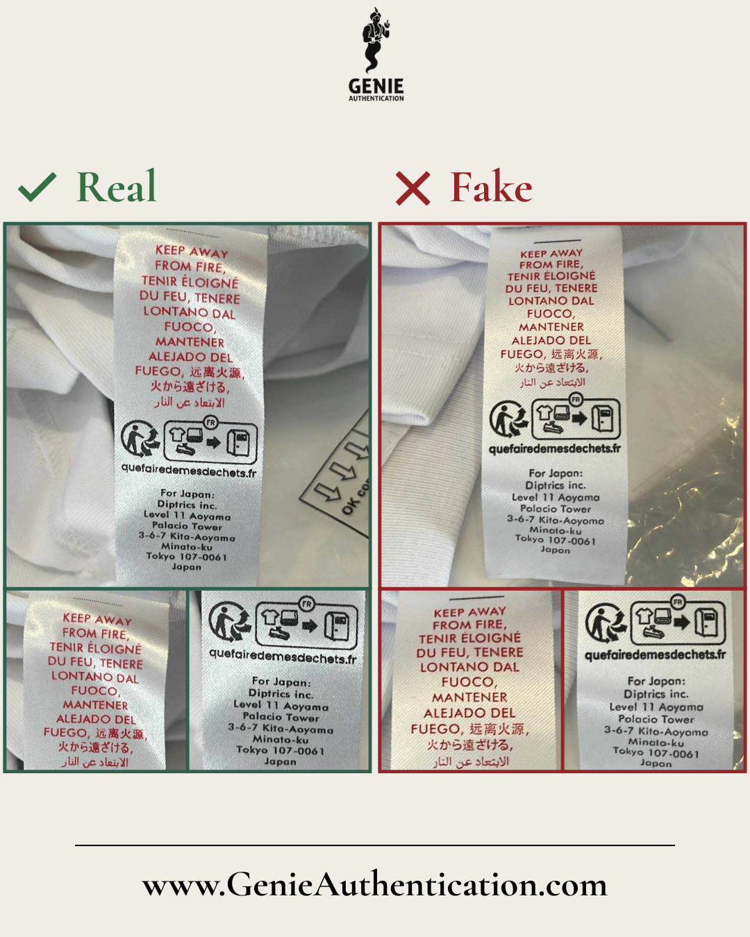
Wash Label (Continued)
In this example, the counterfeit label features text and symbols that are noticeably too thick.
The dots positioned at the top of the label are misaligned, shifted too far to the right, and printed so heavily that they resemble a thick line rather than the fine, delicate dots seen on an authentic label.
Additionally, the counterfeit's print appears unnaturally pristine, lacking the subtle texture present in genuine production.
Note: This guide is not exhaustive. Authentic Casablanca products can vary by model, season, and country of manufacture, so genuine items may differ from the examples shown. Counterfeit versions are constantly evolving, with new variations regularly appearing that may not be documented here. When in doubt, professional authentication is strongly recommended.
At Genie Authentication, we create free resources to provide valuable, accurate, and accessible information to everyone. Our mission is to empower consumers, promote authenticity in designer fashion, and combat counterfeiting. If you've found our resources helpful or learned something valuable, we kindly ask for your support. Consider purchasing an authentication to help us continue offering high-quality, free educational content. Your contribution ensures that we can keep educating and protecting consumers while fighting counterfeit products. Thank you for supporting our mission!
